Flour milling, Cyprus and export
The picture was the problem, not the past
A family mill founded in 1945 wanted to sell its flour abroad. The identity it had carried for decades could not travel. The reflex was to go modern and tone the heritage down. We kept the heritage and changed the picture.
What they believed
Hadjigiorki Mills has milled flour in Frenaros since 1945. By 2020 the business had the certifications, the silos and the lab of a serious producer, it was already shipping to the UK and Greece on request, and the third generation had ambitions well beyond the island. The export line needed a name and a face that a buyer abroad would take seriously.
The working assumption was the ordinary one for a family business at this point. To be taken seriously abroad, the brand had to look modern. The heritage was something to tone down, because the heritage was what made it look local.
That reading treats two different things as one. It took the diagnosis to pull them apart.
What we saw
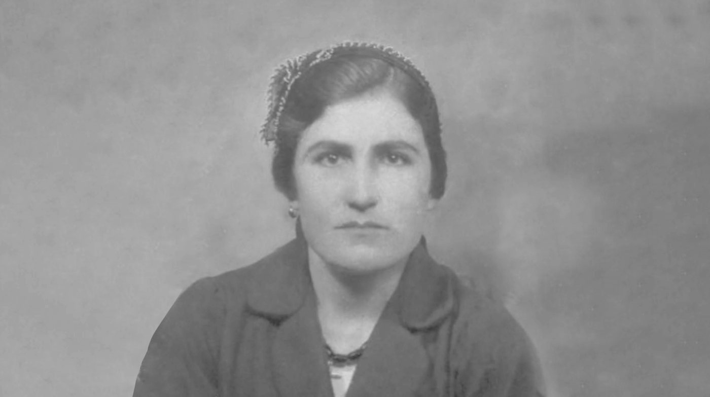
The problem was narrower than the heritage. It was one picture. The identity leaned on an image of a woman seated astride the old stone mill, spreading grain with her hands. At home it read as tradition, and tradition was what people expected from a mill. For an international buyer it would not relate culturally. The image carried a meaning that stops at the island’s shore, and it would have been the first thing they saw.
The woman was the family’s grandmother, Katerina. Nobody in the business wanted to lose her. That tension, a picture that could not travel and a person who could not be dropped, is the whole case in one frame.
Everything else the heritage carried was an asset. Three generations of milling. Relationships with local wheat growers older than the Republic. A caregiving instinct, feeding the island, that the people inside the business recognised as their own without needing it explained. Removing the heritage to fix the picture would have removed the only thing that made a Cypriot mill different from any other mill in Europe.
So the diagnosis separated the two. Heritage was the advantage. The heritage image was the liability. The job was to keep one and lose the other, which is harder than it sounds, because the easy way to lose a bad picture is to lose the past along with it.
What we did before designing anything
We did not start with a design brief. We started with a question: what does Cypriot handcraft look like when it is not folklore?
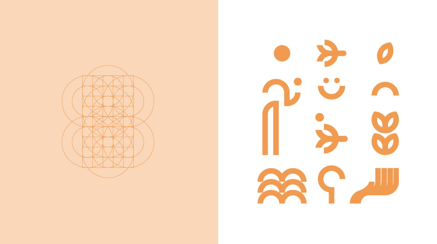
The answer came from a workshop with Hambis Tsangaris, the engraver, whose own work has spent decades proving that a Cypriot visual language can stand anywhere in the world. The session was not about logos. It was about the archetype and the craft: what caregiving looks like inside a mill, what the hand adds that the machine cannot, which forms belong to the island and which only belong to the past.
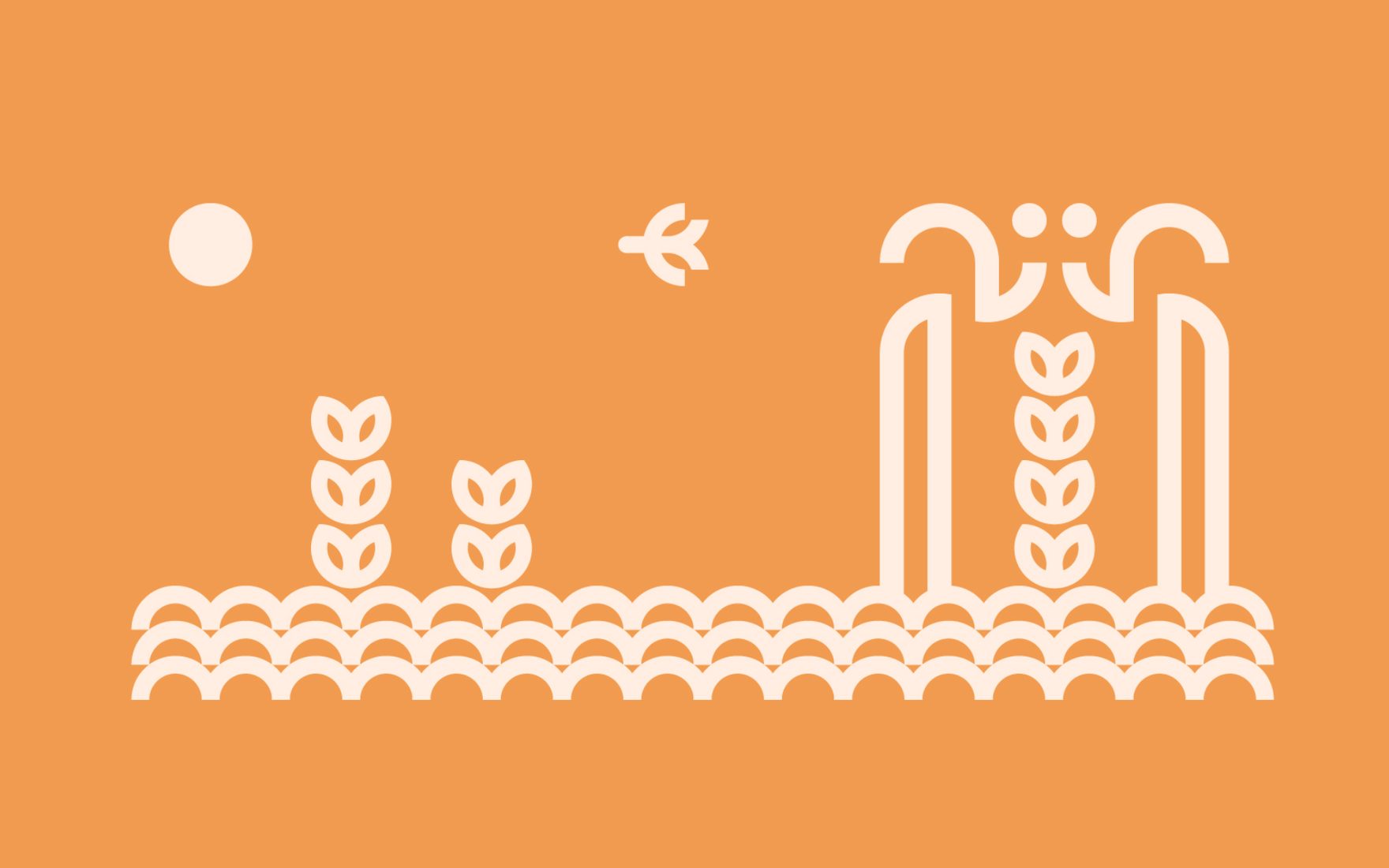
Out of that workshop came the narrative that both brands still carry. The archetype stayed. The handcraft stayed. The picture went.
What changed
The second decision followed from the first. The local brand did not need replacing. It needed a parent. So instead of rebranding Hadjigiorki, we built a group brand above it, and gave the museum the family already ran a bigger job than keeping the past.
Cyprus Millers
The group, facing outward
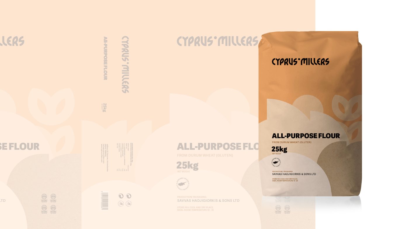
The export line, private label and the industry. Clean enough to sit beside any European mill, Cypriot enough to be the reason you chose it.
Hadjigiorki
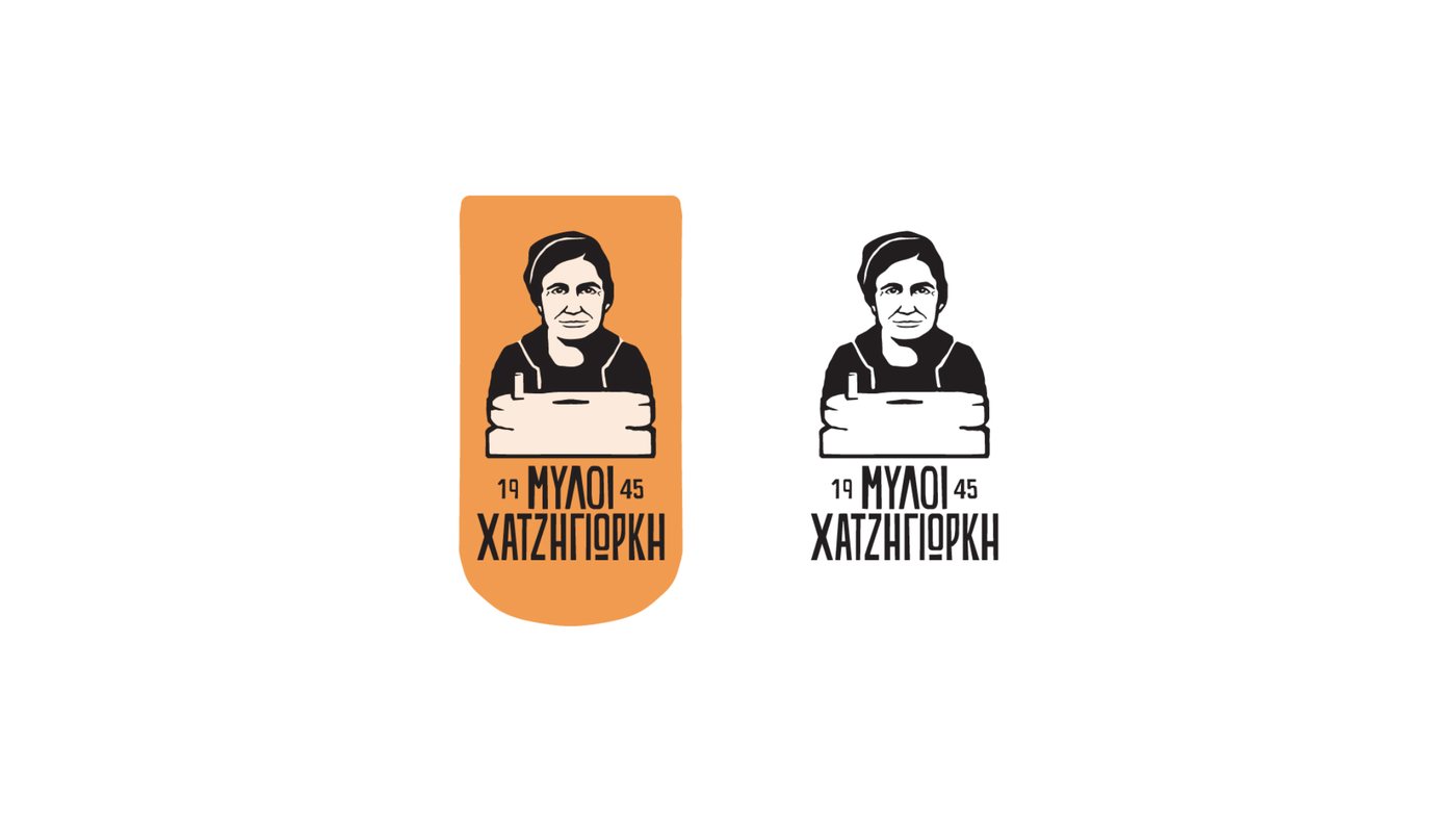
The local brand, kept
The professional and household range at home. Same narrative, same forms, the name three generations of bakers already trust.
The Museum of the Mills
The caregiving, given a centre
Already open in the village. The strategy made it the pillar the growth stands on: education, support for the trade, and giving back to the island.
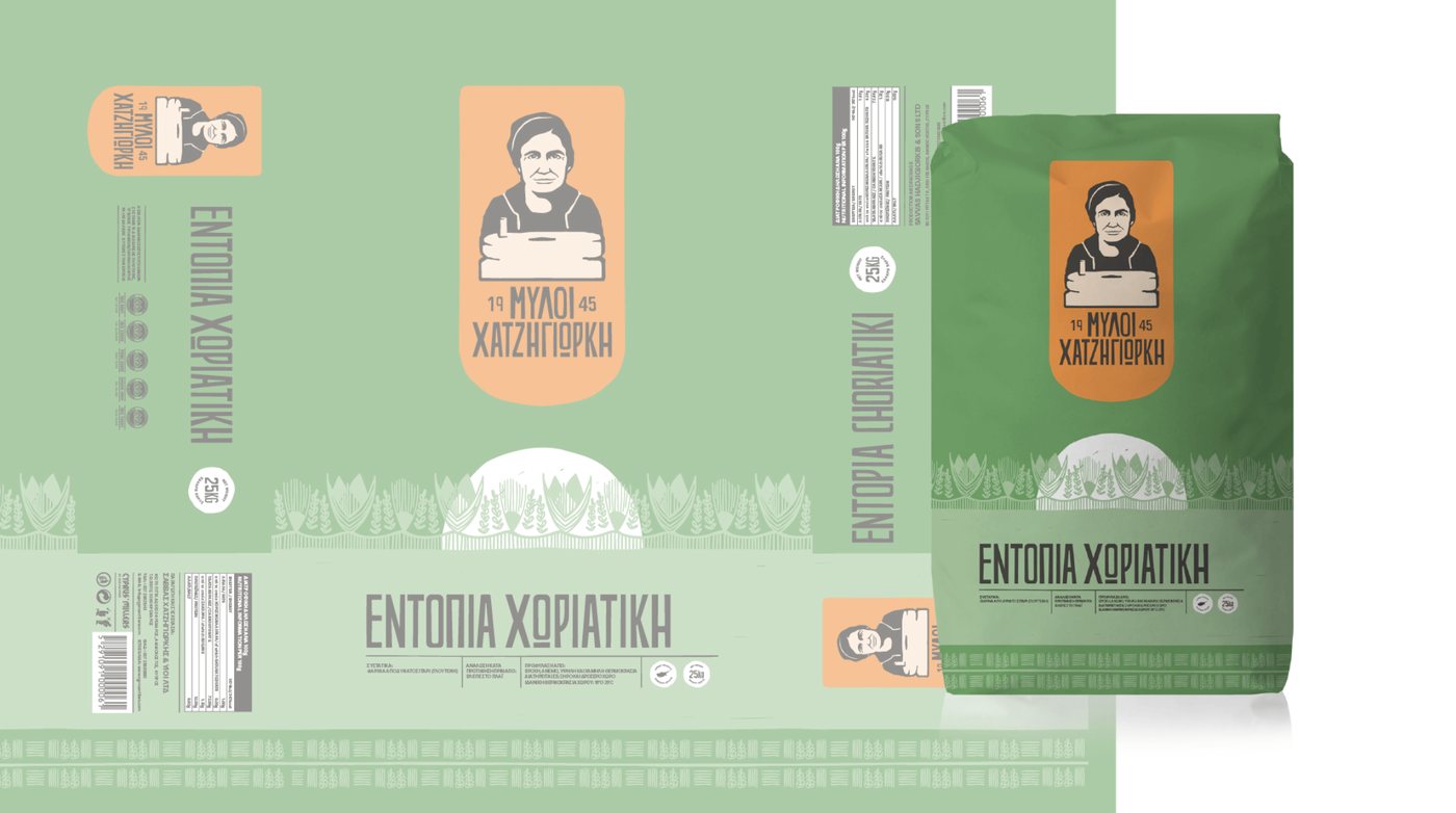
The launch ran from the inside out: the team first, then clients and growers, then the industry, then the public. A new identity that staff hear about from a press article is one they will not defend. By the time the market saw it, the people who answer the phone already called the company by its new name.
The museum is the part most people miss. It was already there, the family’s own, in the village. We did not propose it. What changed was its job. The strategy made it the central pillar of growth and of the caregiving the brand is built on: education, through an academy for the trade; support for the industry the mill depends on; and giving back to the society it has fed since 1945. A heritage museum keeps the past. This one was asked to carry the future.
Once the caregiving had a building and a programme, the packaging did not need to carry a story. It could carry a promise.
Brand identity, packaging and the film by Nekativ. Hivebreed’s part was the diagnosis, the workshop and the brand architecture.
Written by Hivebreed. Cases describe the method and the judgment behind it, not the deliverables. Anything that would hand a client’s advantage to someone else is left out on purpose.