Honey, Cyprus
The jar was not the problem
A honey brand asked us to redesign two labels. The research found that almost nobody in the category could tell which honey on the shelf was actually Cypriot, including the people who were certain they only ever bought Cypriot honey.
What they believed
The brief was packaging. Two labels: one for the everyday product, one for the premium harvest. Make the local roots and the premium taste more visible on the shelf.
Everything around that brief looked settled. Distribution was handled by a national partner. The family had been producing honey since 1950, with an international award behind it. The complaint was that the look had aged and the message needed a refresh. One operational question sat underneath: which pack size to commit to.
A label is a reasonable thing to ask for. It is also the last decision in a long chain, and when a brand reaches for it first, it usually means nobody has examined the chain above it.
What we did before designing anything
We ran the diagnosis before touching the design, in four layers.
A quantitative survey of 403 household shoppers, read as households rather than individuals and extrapolated across the roughly 493,000 households in Cyprus. In-store observation across seven hypermarkets and three local stores, watching how people actually choose honey: whether they reach straight for a brand, how long they hold a jar, whether they read the label or only the price. A 4Cs reading of consumer, culture, category and company, so the survey sat inside the market and the business rather than beside them. And the client’s own sales data, broken down by variety, format and region.
All of it pointed at one question, and it was not a design question. Does this brand need to be repositioned, or does it need to say clearly what it already is?
What the diagnosis found
The most valuable claim in the category was unpoliced. Ninety-eight percent of respondents said they usually buy Cypriot honey. A large number of them then named brands we know to be imported and sold under Cypriot-sounding names. The shoppers were not lying. They had no way of telling. The single most important thing a honey brand can say on this island was being said, loudly and legally, by brands with no right to it.
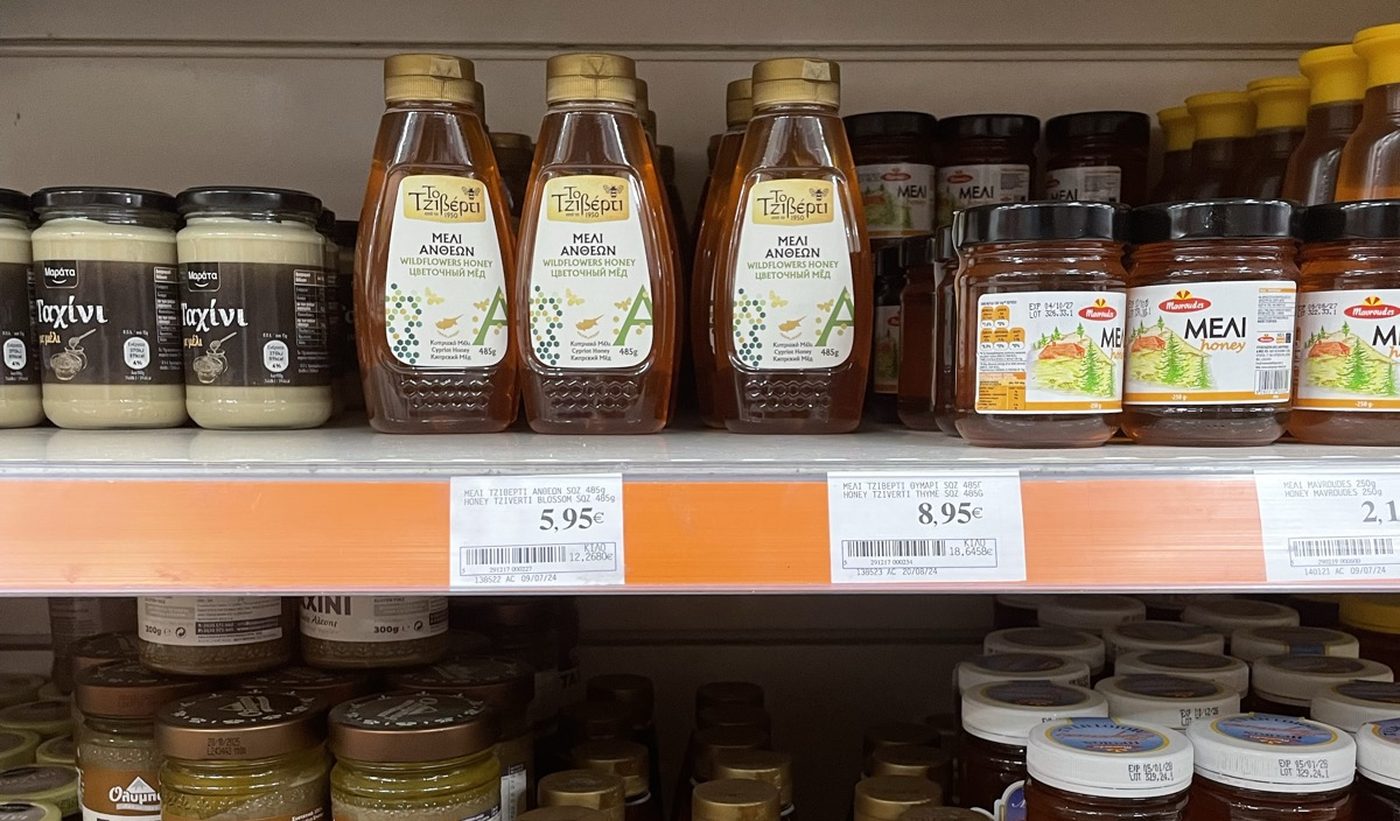
The decision drivers were taste and locality, in that order. Price came fourth. Seventy-four percent said they would pay more for honey that is both locally produced and better tasting, and seventy-nine percent put the fair price of a 500g jar between five and ten euros. Price was not the constraint anybody assumed it was.
The brand was already winning what mattered and losing what did not. Among everyone who had tried it, and seventy-three percent had, sixty-nine percent were satisfied on taste and sixty-eight percent on quality, ahead of both main competitors on every measure we tested. Only fifty-one percent were satisfied on price. Read properly that is not a pricing problem. People rated the honey highly and still felt the price was a stretch, which means the jar was not telling them why it cost what it cost.
Scale was working against it. A belief surfaced repeatedly: the best honey comes from small producers. Being one of the largest honey brands on the island was therefore a liability in precisely the segments most willing to pay. Size was reading as industrial.
What people said they bought was not what they bought. Seventy percent of respondents said they only ever buy regular bottles. The brand’s own sales said something else entirely: the formats people described as occasional were the ones carrying the volume. People were describing the shopper they would like to be, and the till was recording the one they are.
Loyalty rose with pack size, and the largest packs were bought directly from producers rather than in a supermarket. The pack-size question in the brief had an answer, and it was not the one the room expected.
So the deepest problem was never the label’s design. The brand held the strongest genuine claim in its category and was making it more quietly than the brands that had no claim at all. Redrawing the jar would have made a quiet claim prettier.
The strategic conclusion
The answer to our question was no. The brand did not need repositioning. It needed to state what it already was, and then hold that statement everywhere, in the same words, for long enough that people came to believe it.
So we proposed the sentence it should hold. It did not come from the brief. It came out of what the research had just shown about what people already believed, and wrongly believed, about the honey in their own kitchens.
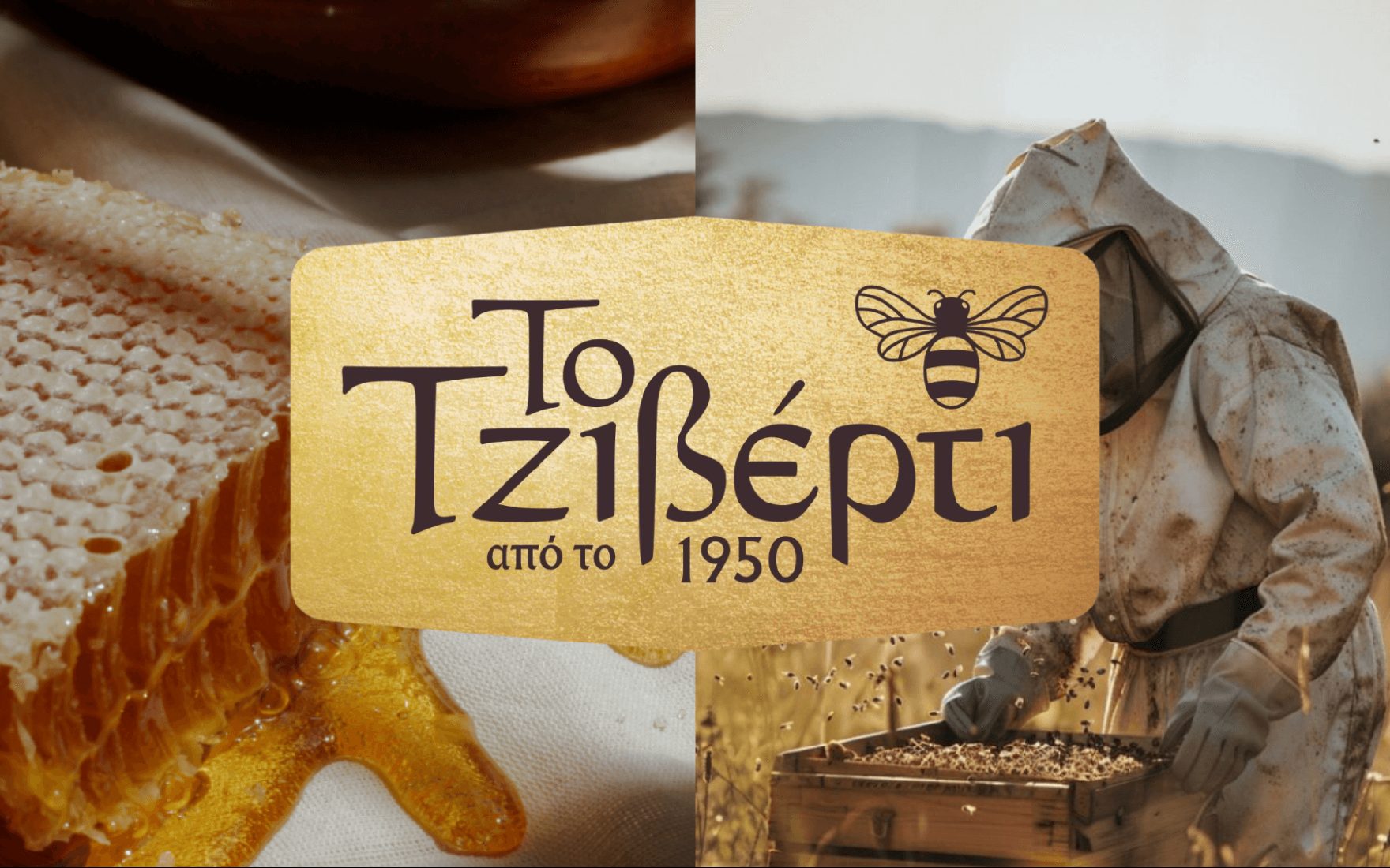
«Το Μέλι της Κύπρου». The honey of Cyprus.
Nobody had asked for a line. They had asked for a label. But a label cannot carry a claim that has not been decided, and the research had just established that the claim was the whole fight.
Treated as a line, that is a slogan. Treated as a platform, it is a claim with obligations. If you are going to say it, it has to be provable on the jar, on the shelf, on film, in other people’s kitchens, and in the place the honey actually comes from. A position has to be singular, tight, important and relative, and it has to be carried by visual, sensory and conceptual codes rather than by a tagline.
Two segments out of five were chosen to carry it, and the other three were deliberately let go.
Those two were not chosen because they were the largest. They were chosen because their drivers, taste and local origin, were the two things the brand already won on and the two things it was failing to say. The budget-conscious were the segment the brand could only reach by discounting the one asset it had.
Three objectives for the year came out of that, with a budget rebuilt from zero against them rather than carried over from the year before. Move value perception up by fifteen percent inside those two segments. Move trial from seventy-three percent toward eighty percent inside them. And open a second revenue stream that does not depend on honey volume at all.
How it was deployed
Each plank below answers a specific finding. Nothing was built because it was available.
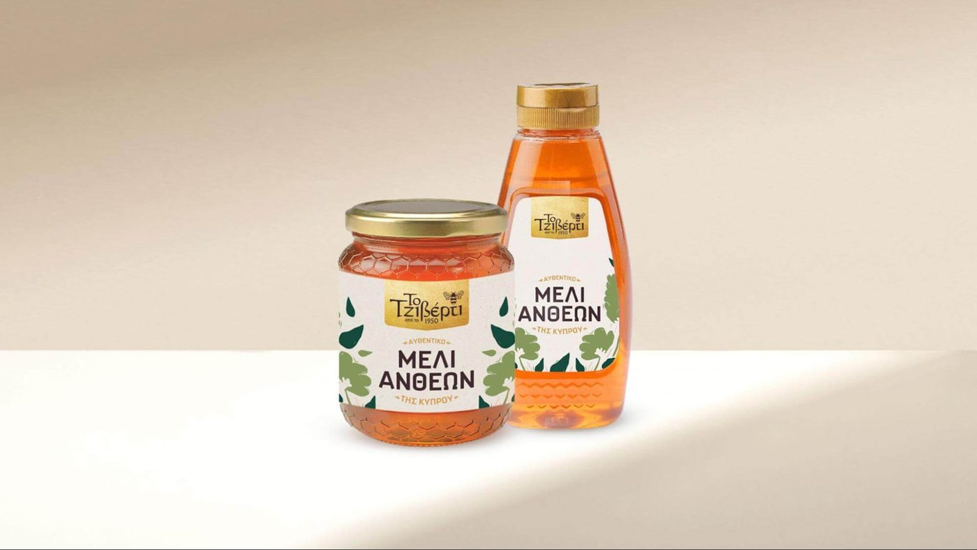
Put the claim on the product. The statement went onto the label itself, with an explicit indication of fully local origin on the lid and a code on the back of the jar leading to the story and the place behind it. The redesign was developed with Nekativ Studio against the strategic brief rather than a visual one. The research protected the gold element and the origin mark, both already strong recognition codes, and sharpened them. It removed what was in the way: competing concepts fighting each other, imitation paper texture, a hive device that read as unclear to consumers, and the general crowding that was burying the one sentence that mattered. Each variety was given its own distinct character so the range read as a range instead of a colour change.
Prove the origin instead of asserting it. A film in Greek, slow, about the land, the hands and the hives. Dawn light on dry Cypriot earth, wild thyme in the wind, an older beekeeper’s hand over a younger one’s on a hive frame, closing on the new label and the words. The direction was explicit about what to avoid: no lifestyle shorthand, no children with bread, no decorative tradition. The point was to show the claim and let the viewer feel it rather than announce it. The same footage then carried into paid distribution, so the brand told one story in both places instead of two. The film was made by JUNO12.
Let other people do the tasting. Honey put into the hands of people who actually cook with it, filming in their own kitchens rather than to a script. Taste is the one claim a brand cannot credibly make about itself. The research had already shown the brand won on taste, so the job was not to assert it again but to let other people say it about food they were going to eat anyway.
Buy frequency, not reach. A short radio sponsorship that gave away one genuine piece of Cypriot food history and signed off with the brand. The brand did not have an awareness problem. Seventy-three percent had already tried it. It had a belief problem, and beliefs move through repetition, so the money went on saying one thing often rather than many things once.
Build somewhere the claim can be visited. Honeymell Park: the family’s own site near Lefkara, open and operating, where the production story, the hives and a honey tasting can be seen instead of described. The audience case for it was tourists first, a market that brought 3.26 million arrivals to Cyprus in the first nine months of 2024 with eighty-five percent travelling for leisure, and local families second. It has never had a formal launch, and it does not need one to do the job it does here. A brand that says it is the honey of Cyprus can be checked, in person, at an address. That is a different order of proof from a sentence on a label, and it earns on its own while it does it.
What changed
The brand stopped asking what its label should look like and started deciding what it is allowed to say.
The jar now carries one sentence instead of five. The origin claim is provable in three places: on the pack, on film, and at an address a family can drive to on a Sunday. The range reads as a range, with each variety distinct. A second revenue stream exists that does not depend on how much honey Cyprus produces in a given year. And the pack-size question that arrived as a design detail was answered from sales data and loyalty behaviour rather than from preference.
None of that came from the packaging brief. All of it came from asking what the packaging was supposed to be fixing.
Written by Hivebreed. Cases describe the method and the judgment behind it, not the deliverables. Anything that would hand a client’s advantage to someone else is left out on purpose.